Culture, Climate Science & Education
SECTION SIX
Digital Image Analysis and Interpretation
Click the Bubbles Above or the Double Arrows () to Explore this Section
A. Introduction
Anyone who extracts information from imagery or photographs is performing image analysis & interpretation. “Old-fashioned” interpretation skills used on hardcopy aerial photographs have not gone out-of-date—rather a new set of digital image techniques compliment traditional means with the power of computer processing.
Even the most powerful computers cannot replace the human mind. Trained image analysts lend human judgment, experience, and insight in transforming raw data into information for decision makers and on-the-ground managers.
Click the Bubbles Above or the Double Arrows () to Explore this Principle
B. Image Interpretation
These elements of interpretation are visual clues people use unconsciously in everyday life. Recognizing the clues can enhance your ability to identify objects and occurrences in both photographic & digital imagery:
Interpretation tasks are what you then do with visual clues:
Strategies for applying interpretation skills (from Campbell 2005):
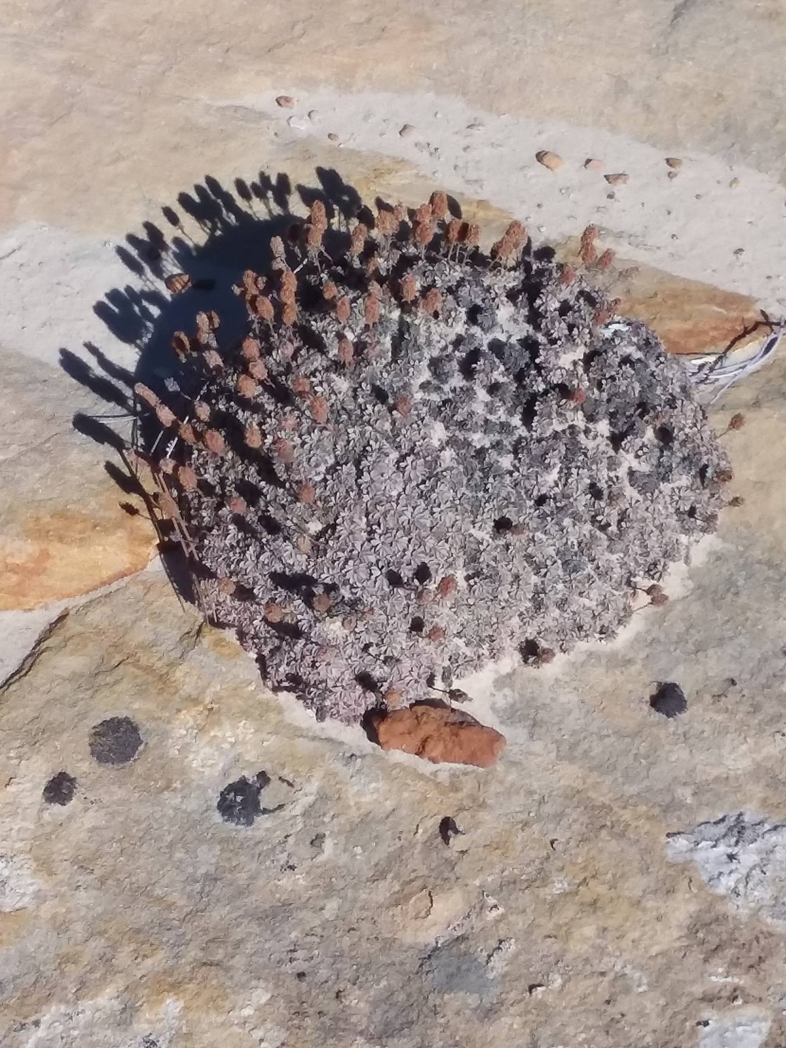
Take several minutes to interpret this image, then, using the elements of interpretation you just learned:
Click the Bubbles Above or the Double Arrows () to Explore this Principle
C. Digital Image Analysis
Digital image analysis harnesses computer processing to extract information from imagery, beyond what is possible with visual interpretation.
Digital image processing techniques can be grouped into the following:
Click the Bubbles Above or the Double Arrows () to Explore this Principle
Click image to expand
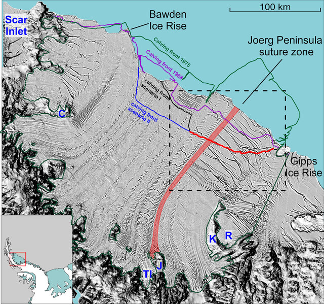
This image is a combination of 1) raster elevation hillshade, overlaid with 2) raster MODIS Aqua image of Antarctic Larsen C Ice Shelf from December 3 2014, and 3) vector lines showing past ice shelf extent (digitized from past imagery). The rift (thin red line) produced the largest ice shelf calving event since the 1980’s. Credit: Jansen et al. 2015
D. Raster Images & Digitizing
Aerial & satellite images are raster datasets—which by definition use cells, also known as pixels, to display and store information. Pictures taken with your personal digital camera are raster datasets. Elevation is frequently displayed with rasters.
We can create information by drawing features on an image—this is called digitizing. Digitizing is a manual image analysis performed by image interpreters. The new information is called a vector dataset, where objects are represented with points, lines, or shapes (rather than pixels).
Both raster and vector data have advantages for different purposes.
Visit this website and explore what satellite sensors tell us about the July 2017 ice shelf calving event.
Click the Bubbles Above or the Double Arrows () to Explore this Principle
E. Image Preparation: geometric & radiometric correction
Click image to expand
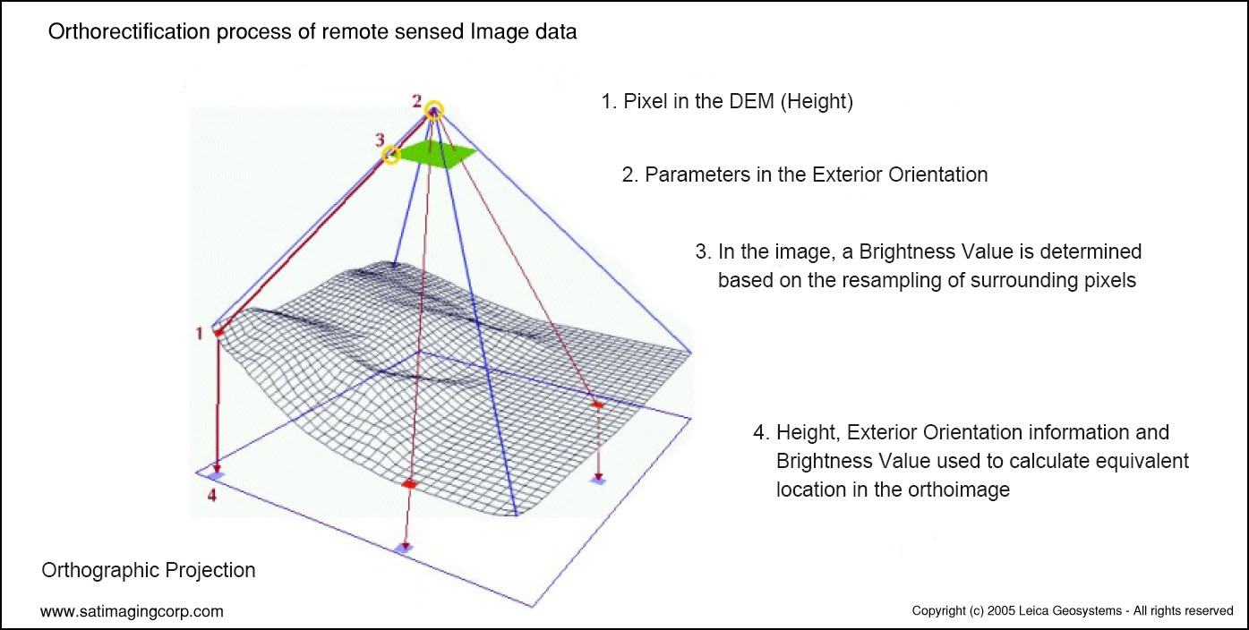
Raw imagery must have some level of correction to be used in a Geographic Information System (GIS). Imagery must be georectified—corrected for distortions due to camera angle perspective—usually including orthorectification, removing image distortion from terrain. For example, an IKONOS satellite swath is ~11 km; 1,000 m of terrain relief would result in distorting features 600 m out of place, if uncorrected (Satellite Imaging Corp. 2017).
Georeferencing aligns the image to projected coordinates on the earth’s surface. This allows the image to be laid over a map in GIS and is usually accomplished as part of the overall rectification process. When you acquire current satellite & aerial imagery, this process is usually complete. You may need to rectify imagery older than a couple decades yourself.
Images with this level of processing are called orthophotos or orthoimagery. In the United States you will see another common term—Digital Orthophoto Quad (DOQ). DOQs are a common way to divide large image files into downloadable pieces or “tiles”. Each image tile corresponding to the boundaries of common USGS “7.5 minute quadrangle” topo maps—hence term Digital Orthophoto Quad (DOQ)
Animated georectification of IKONOS (0.8m) Satellite Image. Credit: Image Copyright © DigitalGlobe and processed by Satellite Imaging Corporation
Visit this website and explore how sun angle and radiance varies by season and write your response
Click image to expand
Source: http://gsp.humboldt.edu/olm_2015/courses/gsp_216_online/
lesson4-1/radiometric.html. Accessed 2018 Dec 26
Click image to expand
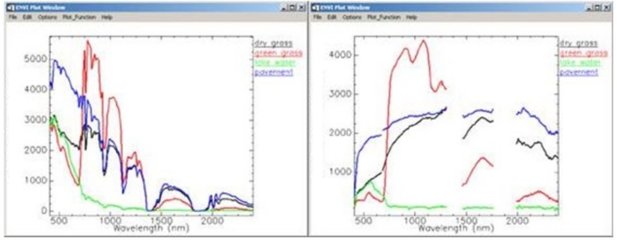
Radiance values are higher on the towards the left because the sun emits most intensely in green wavelengths, ~500 nm. This is normalized in reflectance values, by conversion to percent of reflected energy.
https://www.harrisgeospatial.com/Support/Maintenance-Detail/ArtMID/13350/ArticleID/16278/Digital-Number-Radiance-and-Reflectance
Source: Image courtesy of Spectral Sciences Inc.
Radiometric Correction
To describe features on the earth’s surface, ideally we want surface reflectance spectral data, unaffected by any other variables.
However, before reaching a sensor, light is affected by atmospheric absorption and a sensor also collects some light reflected by the atmosphere. Sunlight has variations too—there are slight daily variations in emitted energy, variations in sun-earth distance, variations in sun-angle depending on season and time of day, and variations in atmospheric haze.
Depending on the question you are asking and the image analysis technique you are using, these variations may require radiometric correction.
Many remote sensing applications do not require the extra process of atmospheric correction, such as classification or change detection (Chinsu et al 2015). Other image analysis techniques normalize atmosphere indirectly (e.g. some band ratios). Multispectral scanners (e.g. Landsat) are designed to accommodate some atmospheric absorption and are less vulnerable than hyperspectral sensors.
Processing Levels
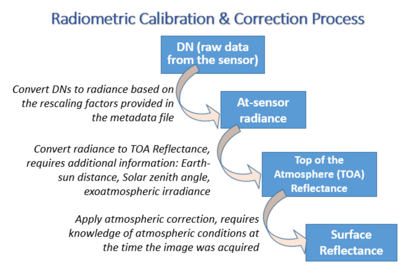
Pixel brightness levels in raw imagery are expressed in Digital Number (DN) format (e.g. ranging from 1 through 256 for 8 bit imagery). DN’s can be converted to units of energy—at-sensor radiance—with calibration scaling given in imagery metadata. Top of atmosphere (TOA) reflectance and finally surface reflectance are the highest level of radiometric correction.
Publicly available NASA imagery (e.g. Landsat & MODIS) is typically delivered orthorectified but without radiometric correction (i.e. you receive digital number imagery); many researchers prefer to control radiometric corrections themselves. The USGS (archive and distributer of US imagery) provides radiometric calibrated imagery on request, free of charge, on EarthExplorer website. Labels for general USGS image processing levels are:
Click the Bubbles Above or the Double Arrows () to Explore this Principle
F. Resampling & Image Registration
Click image to expand
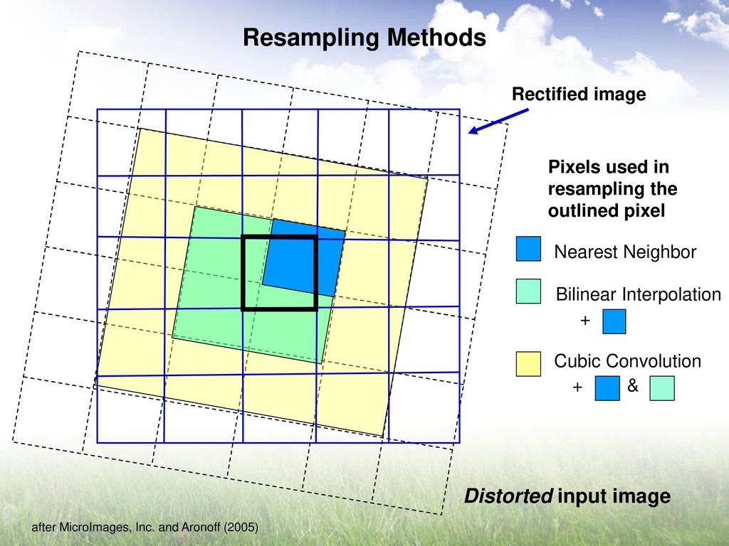
Three resampling options for calculating new pixel values
Source: Berry, Beryl. https://slideplayer.com/user/14083362/
Click image to expand
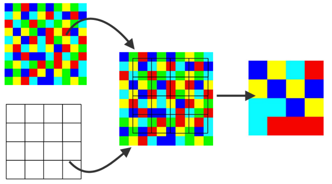
Resampling can also be used to modify image pixel size.
Source: https://knowledge.safe.com/articles/70322/modify-raster-cell-size-by-resampling.html
Georectification warps & shifts the pixel grid from the original image—old and corrected pixels do not align. Resampling inserts pixel values into the new projected grid.
Resampling is also used to modify pixel size—either way resampling calculates new pixel values for a modified cell grid. For example, resampling could be used to reduce file size for an elevation raster by making cell size coarser.
Resampling can be used to modify the spatial resolution of an image so it matches the pixel size of another image. Image registration perfectly aligns pixels after the resampling process. Matching pixels in this way is necessary for studying change over time—this way landscape changes are detected, rather than mere changes in pixel alignment. Consider studies of glacial or landcover change.
Click the Bubbles Above or the Double Arrows () to Explore this Principle
Click image to expand
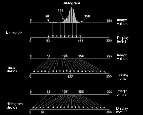
Several options for contrast enhancement (i.e. histogram stretch). The histogram chart shows frequency of pixel brightness values; the tallest bars are the most common pixel brightness (about 135 here). Illustration from Lillesand et al. (2015) Remote Sensing and Image Interpretation, 7th Ed.
G. Histogram Stretch: contrast & brightness enhancement
When first opened in a GIS program, a satellite image often first appears dark, with little contrast. Sensors are calibrated to detect a very wide range of brightness levels—and pixel brightness values are often lumped into the middle of the 0-255 shades of gray.
This results in an image with low contrast at first—however you can increase contrast by “stretching” the pixel values across the full 0-255 shades of brightness.
Click image to expand
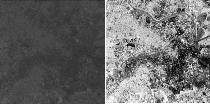
Original and stretched image. NPTEL & IIT KANPUR. 1999 Dec 31. https://nptel.ac.in/courses/105104100/23
Click the Bubbles Above or the Double Arrows () to Explore this Principle
H. Pan-sharpening
Click image to expand
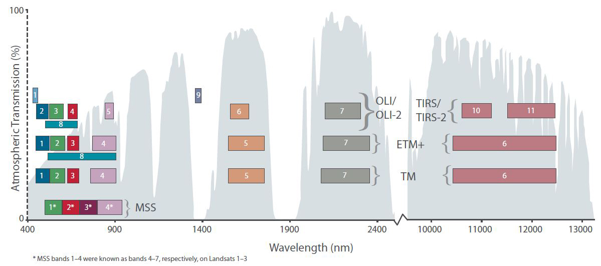
Band 8 is panchromatic for Landsat 7 (EMT+ sensor) and Landsat 8 (OLI sensor).
Click image to expand
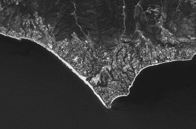
Panchromatic Band, (15 m)
Panchromatic sharpening is a way to increase the detail (spatial resolution) of an image. In a nutshell, a high-resolution gray-scale panchromatic band is combined with lower-resolution “color” multispectral bands. The result has visual advantages of both—high resolution multisprctral images.
Several multispectral satellite sensors have a “panchromatic” band—a single band that covers visible wavelengths (exact wavelength range varies by sensor, see graphic). Panchromatic sensors can “afford” to have higher spatial resolution because they capture more energy (from a wider wavelength range) and lump that brightness into one image file. Dividing visible light into 3 bands (RGB) requires 3 times as much storage space.
Publicly available commercial satellite imagery has panchromatic resolutions as fine as 31 cm (WorldView-4 satellite, operated by DigitalGlobe https://www.digitalglobe.com). Landsat offers free 15 meter panchromatic resolution.
The following graphics show a pan-sharpened Landsat 8 image of Malibu California. Malibu Images Credit: Charlie Loyd, MapBox, published June 14, 2013. https://landsat.gsfc.nasa.gov/landsat-8/landsat-8-bands/
Click image to expand
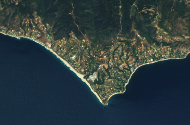
Normal Color, not pan-sharpened (30 m).
Click image to expand
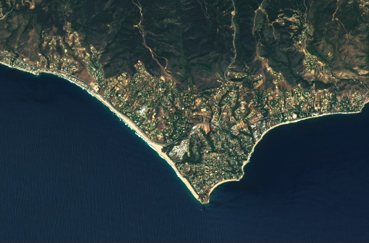
Normal Color, after pan-sharpening.
Click the Bubbles Above or the Double Arrows () to Explore this Principle
I. Spectral Bands and Feature Detection
In the Spectral Reflectance section of this course, you learned that each part of the Electromagnetic Spectrum (EMS) tells a different part of the earth’s story. Understanding spectral reflectance is an essential part of using remote sensing; if you need a refresher, review the “Extra Learning” compilation below.
Click the Bubbles Above or the Double Arrows () to Explore this Principle
J. Bands Combinations & Classification
Visit this website (which you first saw in the “Characteristics of Imagery” section).
Band combinations are a way to visually classify an image—classification is identifying categories of features or landcover. There are no set rules for which bands to use, that is up to the analysis. Some common band combinations are reviewed in the activity below.
Next you will see how computers and remote sensing image analysis can be used to “automatically” classify pixels into landcover categories.
Click the Bubbles Above or the Double Arrows () to Explore this Principle
K. Classification
Visit this website and follow the instructions.
Organizing things into groups is one way humans understand and the world. In remote sensing, identifying features into useful categories helps us interpret what is happening on the earth’s surface and monitor change over time.
Manual visual classification can require lots of time from trained interpreters to cover relatively small areas. Digital image analysis statistically lumps pixels into groups of similar spectral reflectance—these semi-automated techniques allow interpreters to process huge areas and timelines of imagery.
Click the Bubbles Above or the Double Arrows () to Explore this Principle
L. Supervised Classification
Click image to expand
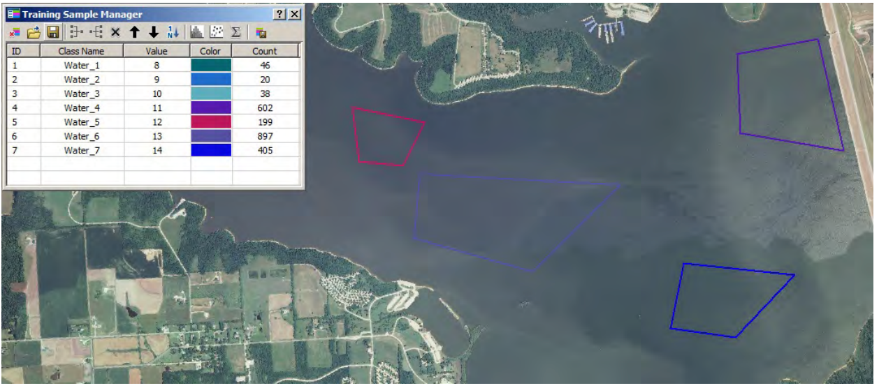
Supervised classification “training samples” are manually drawn over an image. Computer software then automatically classifies all pixels in the image, grouping pixels into your sample categories. Credit: KIKSAPA Geospatial Tutorial 2017
In supervised classification, you show the computer how to group pixels into categories. You, the analyst, decide what landcover categories exist in your image. After you draw training samples for each category, the computer lumps all pixels into your groups.
Some trial and error is often involved (1) creating categories your software can tell apart from reflectance, and (2) drawing training areas that represent each category.
Click image to expand
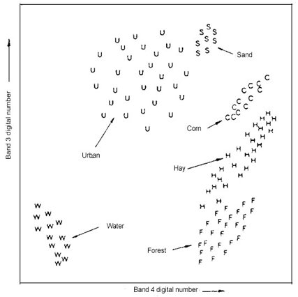
Plotting reflectance values from two bands. This visualizes groups of pixels with similar reflectance. Each letter, e.g. “U”, represents a pixel. Only two bands can be displayed on a 2D plot, however your computer can compare multiple bands at once. Credit: Lillesand & Kiefer 2015
Click image to expand
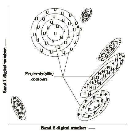
Overlapping groups (similar reflectance) make classification more difficult and error-prone—these groups are fairly distinct. The circles represent probability curves for the maximum likelihood approach to supervised classification. Credit: Lillesand & Kiefer 2015
Click the Bubbles Above or the Double Arrows () to Explore this Principle
M. Unsupervised Classification
Click image to expand
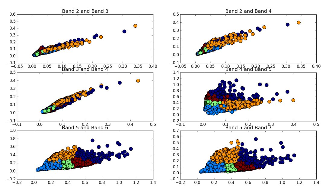
Five classification groups, plotted with Bands 2, 3, 4, 5, 6, & 7. Your computer can evaluate several reflectance bands at once, to classify pixels. Credit: Andrew Cutts, February 5 2017 http://www.acgeospatial.co.uk/unsupervised_points/
Questions:
- What bands are best able to separate the 5 landcover classes, in the graphic above?
- What bands cannot “see” differences in the 5 classes very well?
Click image to expand

With unsupervised classification, the groups would be labeled simply 1, 2, 3… until you categorized them). Credit: Lillesand & Kiefer 2015
Questions:
If you did an unsupervised classification for the above graphic, choosing 6 classes, your software would probably be able to separate the 6 groups.
- What might unsupervised classification result be if you chose 5 classes?
- What might the result be if you chose a four-group classification?
With unsupervised classification, you, the analyst, decide how many groups exist in your image; your software then lumps similar pixels into that many classes. Your computer takes the first turn at categorizing pixels, based on statistical grouping of reflectance.
Your computer does not know what the groups are, it just knows the pixels are similar (groups are labeled 1, 2, 3 rather than water, forest, pasture, for example). The image analyst is then responsible for identifying the classes and lumping classes into useful groups (e.g. combining deep water & shallow water). Trial and error may lead you to begin with more or less groups; starting high and then lumping is often useful.
Click the Bubbles Above or the Double Arrows () to Explore this Principle
N. Hybrid Classification Techniques
Visit this website
In addition to spectral reflectance, datasets like elevation can be used in supervised or unsupervised classification—this is sometimes called hybrid classification.
For example, grand fir and subalpine fir forests could have inseparable spectral reflectance in an image. However, incorporating elevation with your spectral classification would allow you to identify the high elevation species.
Other datasets that can be used in classification include:
Click the Bubbles Above or the Double Arrows () to Explore this Principle
O. Thematic Accuracy
Click image to expand
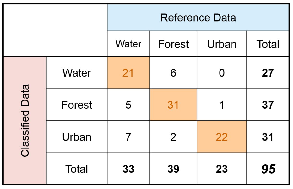
An error matrix can be used assess classification accuracy. Credit: Congalton & Green 1998.
Thematic accuracy measures how well pixels are classified into the correct group (theme). The true “reference” values are collected by ground truthing—checking classifications in the field. Higher resolution imagery may also be useful when ground truthing is not possible.
Overall accuracy shows how many pixels (%) were classified correctly. In the above table, correctly classified pixels were 21+31+22 = 74. Divided by 95 total pixels = 77.9% overall accuracy.
Errors of Omission are reference pixels that were left out of the correct class—go down reference columns to calculate. Water reference cells were incorrectly classified 5+7 = 12 times out of 33 reference cells. Omission error for water is 12/33 = 36%
Producer’s Accuracy is from the map maker’s perspective: how often are real features on the ground correctly shown on the map. It is a compliment of Omission: producers accuracy = 100% - Error of Omission.
Water = 100% - 36% = 64%
Errors of Commission look across classification rows for incorrect classifiations. Water incorrectly classified pixels are 6+0 = 6 out of 27 classified pixels. Commission error for water is 6/27 = 22%
User’s Accuracy is from the map users perspective: how often the classification on the map will actually be present on the ground. It is a compliment of Commission: user’s accuracy = 100% - Error of Commission. Water = 100% - 22% = 78%
Click the Bubbles Above or the Double Arrows () to Explore this Principle
P. Change Detection
Activity Six: USGS Image Comparison Sliders
Visit this website
Activity Seven: Mount Saint Helens Eruption
Visit this website
Activity Eight: Change Matters
Visit this website
Satellite imagery gives us continuous earth observations since 1972 (Landsat), while declassified military imagery (1960’s) and historic aerial photos (1930’s or earlier) extend our remote sensing knowledge to earlier decades. Given the frequent image cycle (temporal resolutions of a day to a few weeks), detecting earth changes over time is among remote sensing’s most significant strengths.
Many of the classifications and indices covered in this course can be analyzed in the context of change. For example, you can compare landcover classifications over time to detect changes in human development. Vegetation indices can be analyzed over 2+ dates to detect regenerating vegetation or forest health issues. The Normalized Burn Ratio requires a change analysis to describe fire burn severity—before and after a wildland fire event.
Click the Bubbles Above or the Double Arrows () to Explore this Principle
Q. Spectral Indices and Ratios
Click image to expand
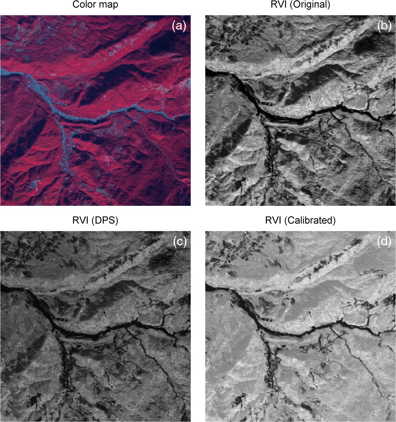
Satellite image adjustment approaches for terrain shadow. (a) Color map. (b) Standard ratio vegetation index (RVI). (c) Dark pixel subtraction (DPS) RVI. (d) Calibrated RVI (Kao et al 2014). Image from Kao et al. (2014)
Click image to expand
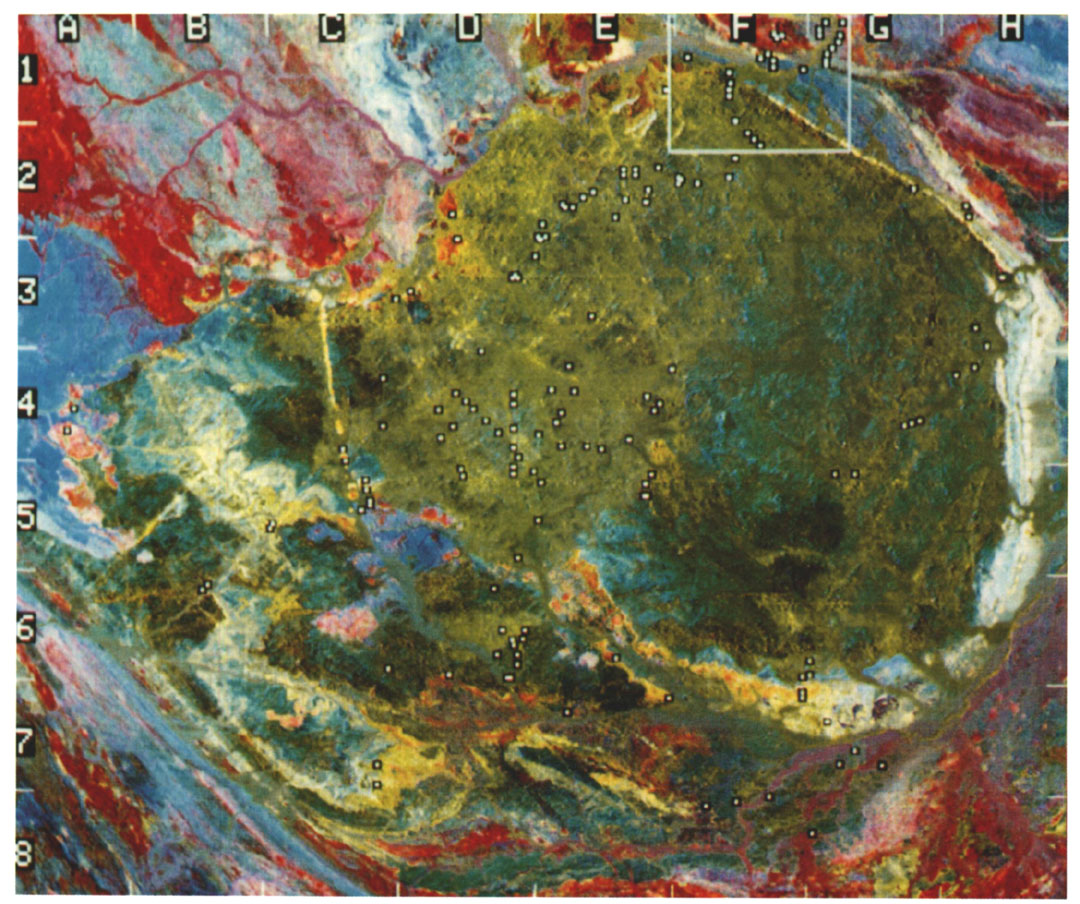
Color composite of Landsat TM band ratios: band-5/1, band-5/7, and band-5/ 4 x 3/4 ratio images, from Sultan et al. (1987).
Band combinations can visually highlight features in an image, showing different wavelength bands as Red, Green, & Blue (RGB) on your display. The following indices & ratios are ways to quantify that spectral reflectance.
Band Ratios
Simple band ratios divide one band by another (e.g. NIR / red). Band ratios help remove effects from illumination angle, shadows, and terrain—revealing information about actual earth surfaces.
Band ratios can also be displayed in RGB composites (in place of regular band reflectance values). Sultan et al (1987) provided groundbreaking insights on remote sensing for geology and used a mineral-revealing composite of Landsat TM band ratios: band-5/1, band-5/7, and band-5/4 x 3/4, composite-displayed as Red, Green, and Blue.
Spectral Indices
Index values are calculated from spectral reflectance for each pixel; they allow us to take biophysical measurements of earth surfaces, with relative consistency, compared to visual analysis.
Indices have been developed for a very wide range of applications, including vegetation, atmosphere (temperature, ozone, NOx, fire smoke), water (temperature, sediment, algae), snow & ice, wildland fire burn severity, etc.
Harris Geospatial Solutions distributes “ENVI”, a popular image processing software for remote sensing. Their website features many remote sensing resources and articles. Visit their website and
Revisit this website and explore how indices work:
Click the Bubbles Above or the Double Arrows () to Explore this Principle
R. Vegetation Indices
All sorts of human activities are affected by vegetation, and vice versa. The ability to measure vegetation type and abundance is useful for predicting crop yields, tracking tropical deforestation, describing wildlife habitat, estimating biomass, leaf area index (LAI), and carbon cycling.
Normalized Difference Vegetation Index (NDVI) was developed soon after the launch of Landsat 1 in 1972. Rouse et al (1973) found a ratio of NIR & red reflectance, used to monitor spring green-up in the Great Plains, normalized much of the difference in sun illumination between lower and more northern latitudes. NDVI is perhaps the most-used index in remote sensing.
Enhanced Vegetation Index (EVI) was developed to reduce errors from atmospheric aerosols and provide better measurements in densely vegetated areas (e.g. rainforest) where NDVI tends to saturate.
Interpreting NDVI
NDVI can range from -1 to +1. Water heavily absorbs near infrared (NIR) light, resulting in often negative NDVI values. NDVI for other surfaces:
*Threshold values from: John Weier and David Herring, NASA. August 30, 2000. https://earthobservatory.nasa.gov/features/MeasuringVegetation
Click the Bubbles Above or the Double Arrows () to Explore this Principle
S. Snow and Ice
Click image to expand
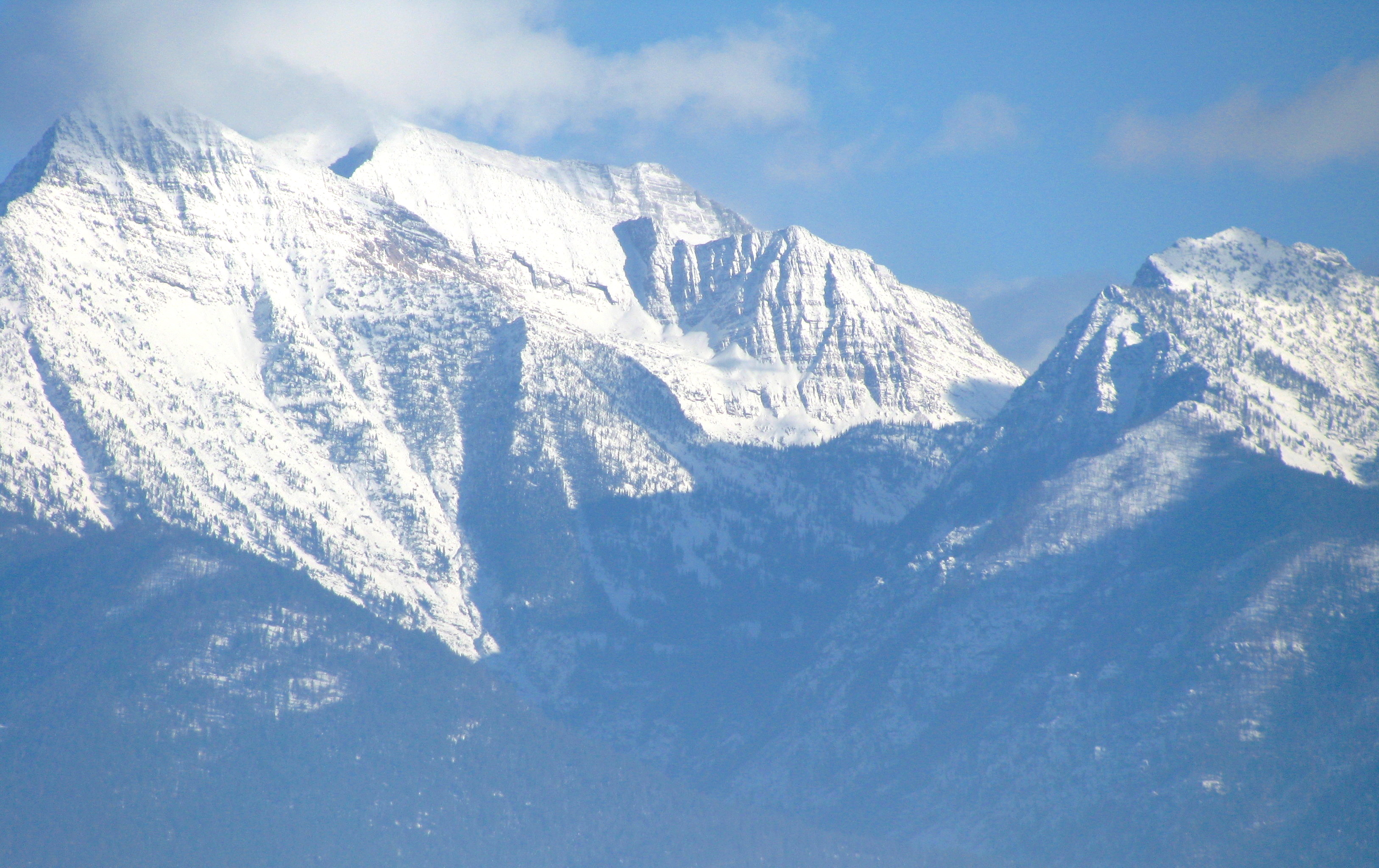
Alpine snow in Mission Mountains Montana, Flathead Indian Reservation. In mountainous regions, water availability for agriculture and human use depends on snowpack. Grizzly bear & wolverine also depend on snowpack for denning habitat. Meltwater from glaciers and perennial ice fields feed streams with cool water during dry summer months, critical for threatened bull trout, a living cultural resource and traditional winter food for tribes of the inland northwest. Photo credit: Kenning, 2007 Nov 26.
Visit this website and learn the science behind the retreat of glaciers in Glacier National Park
Click image to expand
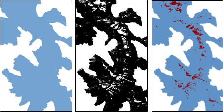
Ice field extent over time. Average ice decrease was 4.8 acres/year from 1987 to 2009. Credit: Cody Sifford 2010
Monitoring snow and ice gives predictions of alpine snowmelt and water availability and is useful for describing impacts of climate change. Indices help distinguish ice from clouds (which reflect more infrared radiation than ice).
Normalized Difference Snow Index (NDSI; Hall 1995) gives estimates of snow cover and snow vs ice type from multispectral sensor data. A variant called Normalized difference snow and ice Index (NDSII; Xiao 2001) utilizes bands from sensors with higher spatial resolution (e.g. 1 meter SPOT satellites).
These two indices use visible & infrared energy, offering high spatial resolution but limited information about snow/ice depth. Microwave sensors offer more information about depth and snow water equivalent, but are currently restricted to coarse pixel size of several kilometers.
Image Analysis Example: Snow and Ice Over Time
Here is an analysis methods outline, to give you a more full picture of a remote sensing study.
Perennial ice fields are not large enough to move under their own weight (as glaciers do) yet they are deep enough to persist through the summer. A student project at the Salish Kootenai College used Landsat imagery to take a preliminary look at how much ice now persists in the Mission Mountains of the Flathead Indian Reservation, compared to decades ago.
Click the Bubbles Above or the Double Arrows () to Explore this Principle
T. Wildland Fire Severity
Click image to expand
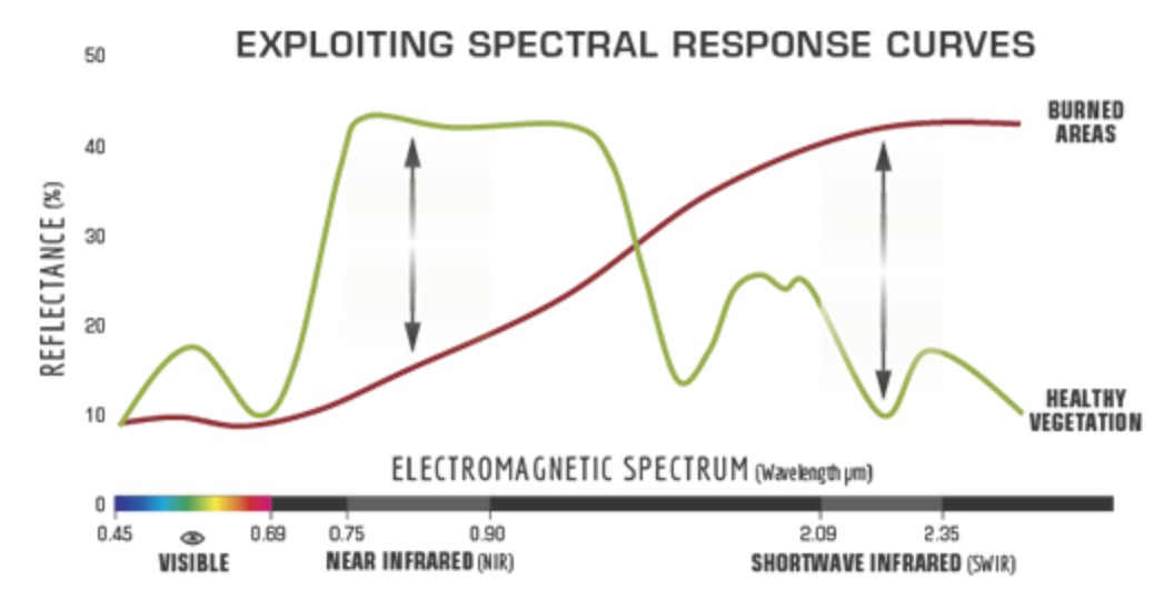
Spectral differences between burned and non-burned areas. Credit: US Forest Service
Click image to expand

Suggested burn severity threshold values. Thresholds may change from image to image. Credit: US Geological Survey
Normalized Burn Ratio (NBR)
After fire, a burn severity map can be used to prioritize restoration areas and erosion control. In the United States, Burned Area Emergency Response (BAER) teams are given maps of burn severity—areas most impacted by fire.
A difference (ΔNBR) index shows areas that have suddenly changed. Before and after imagery are collected as close to the fire dates as possible. A follow up 1-2 years post-fire can be used to show both delayed mortality and regrowth.
Click image to expand
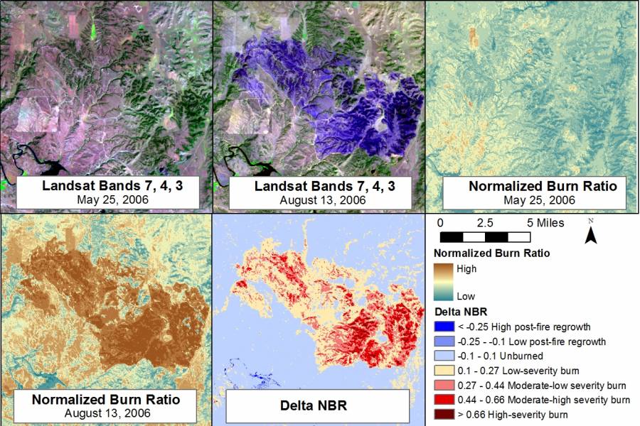
Steps to calculate burn severity, showing Camp Guernsey fire, Wyoming, 2006. Imagery before & after fire. NBR before and after fire. The final step—Difference (delta) NBR shows burn severity. Credit: USDA-ARS Jornada Experimental Range. 2012 Feb 22. https://wiki.landscapetoolbox.org/doku.php/ remote_sensing_methods:normalized_burn_ratio
Click the Bubbles Above or the Double Arrows () to Explore this Principle
U. ClimateEngine.org
Visit this website. (Google Chrome web browser is the most reliable for this app.) 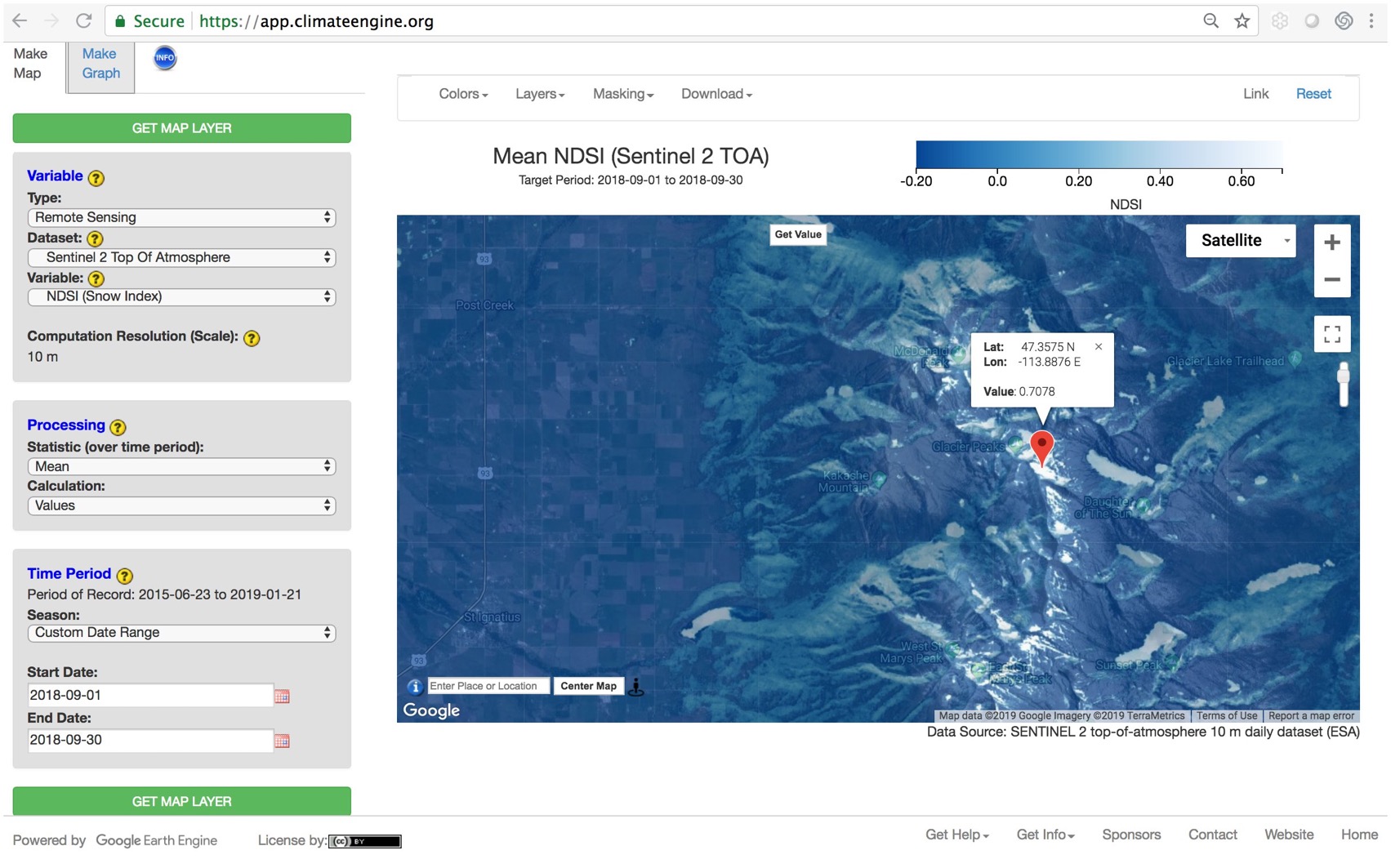
Question: why did I have you analyze snow in September, rather than during the winter?
Write your answers. Hint, the choice for Sentinel-2 has something to do with spatial & temporal resolution, and time range.
Next, you will analyze late winter (March) snowpack. Change your Variable, Processing, and Time Range options to match the screenshot. The SNODAS dataset combines snow data from satellite, airborne platforms, and ground stations to model estimates of snow cover.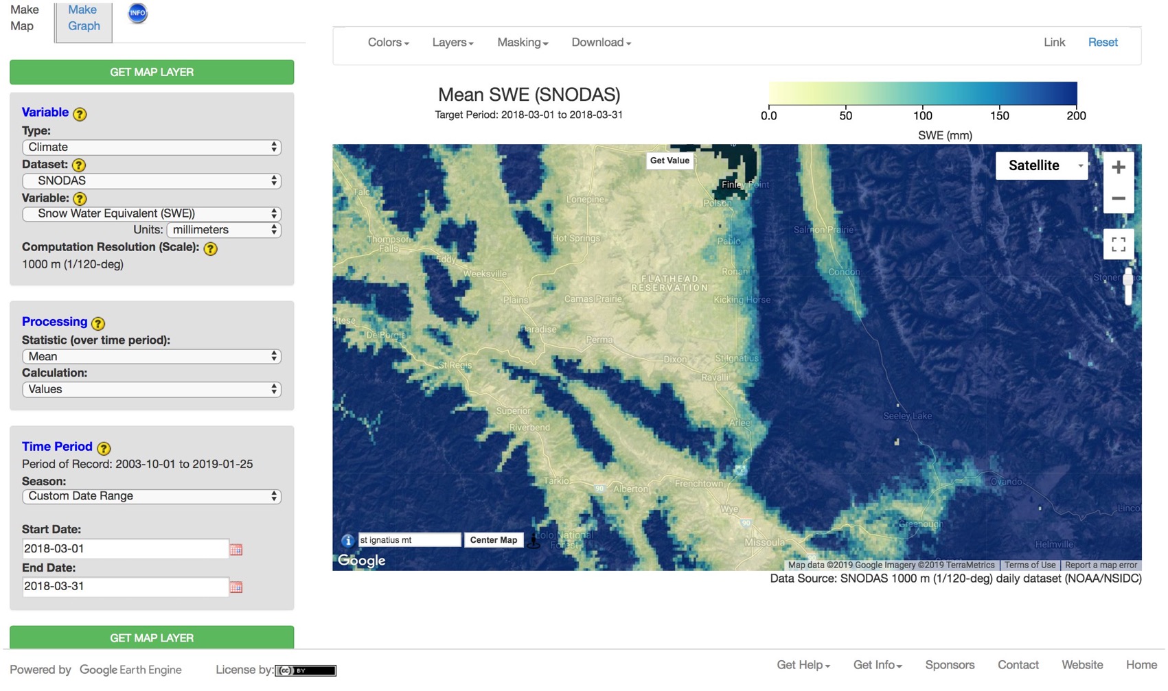
Question: what is the spatial resolution of SNOWDAS? Write your answer.
Now use ClimateEngine.org to answer a question of your choice. You can choose any location and any dataset.
The tutorials at the end of this course will show you how use ArcGIS Image Analyst software. GIS software is powerful, adaptive, and in demand for careers ranging from natural resource, historic preservation & archeology, urban & emergency planning, etc. Typical GIS analysis requires a fair amount of training and expensive software licensing.
Cloud-based computer processing is opening the door for geospatial and image analysis, performed with relative ease without the need for installing software or even data on personal computers. Of course, varying levels of background knowledge (which you are developing) are required for varying confidence of results. However the usefulness of cloud-based image processing for educational purposes is, at the very least, a small revolution. Time required to download & radiometrically correct a time series of imagery is drastically reduced.
Next you will get a quick introduction to remote sensing image analysis with ClimateEngine.org, a web app that provides access to Google’s EarthEngine (which otherwise requires knowledge of the scripting languages Python or Java).
Click the Bubbles Above or the Double Arrows () to Explore this Principle
V. Modeling and Remote Sensing
Click image to expand
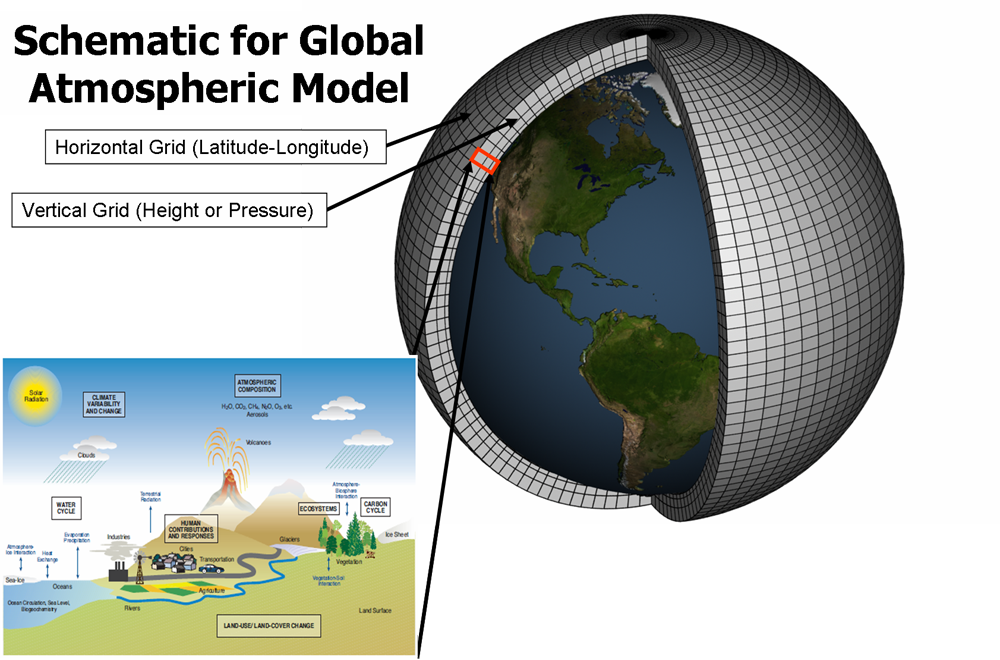
Climate models are systems of differential equations based on the basic laws of physics, fluid motion, and chemistry. To “run” a model, scientists divide the planet into a 3-dimensional grid, apply the basic equations, and evaluate the results. Atmospheric models calculate winds, heat transfer, radiation, relative humidity, and surface hydrology within each grid and evaluate interactions with neighboring points. (Caption from NOAA, 2012 Feb 18) http://celebrating200years.noaa.gov/
breakthroughs/climate_model/welcome.html
Visit this website and explore the difference between natural and human-caused climate changes.
Visit this website and this website and learn about the several models that couple together to create the National Center for Atmospheric Research (NCAR) GCM.
A model is a simplified version of the complex natural world, used to describe or predict things. A map is a generalized model describing the earth. Image classification predicts landcover from spectral reflectance information.
Models can use simple information to answer simple questions—“when will I be hungry again?” Models can be very complex—Global Climate Models (GCM’s) combine interactions between atmosphere, ocean, land, and ice. Climate models are always being improved with the latest science. They allow policy decision makers to see outcomes of different scenarios—such as reducing greenhouse gas emissions, or not.
Remote Sensing image analysis often supplies information used in GIS and geospatial models.
Habitat Suitability Indices (HSI) are models, describing habitat quality for a species plant or wildlife. Information often includes vegetation & landcover classification, elevation, and other remote sensing products. These models may need updates to reflect climate impacts on habitat.
Read through the pdf below and write down the 4 pieces of information this habitat model uses to predict elk habitat quality (i.e. what are S1 – S4)?
Question: Which of these can be estimated with remote sensing?
Read the article below about common camas (Camassia quamash), an important food plant for many northwest tribes.
Imagine you wanted to use GIS to identify the best sites to restore camas—write down landscape information you would need.
Question: Which pieces of habitat information are likely from remote sensing?
Click the Bubbles Above or the Double Arrows () to Explore this Principle
W. Applications of Remote Sensing
Visit this website and read the article about remote sensing and mule deer. Write down (1) study objective, (2) remote sensing dataset(s) used, and (3) analysis method.
Visit this website and visit two more articles of your choice. For each article, write down (1) study objective, (2) remote sensing dataset(s) used, and (3) analysis method.
Throughout this course, you have seen examples of remote sensing helping us better understand and make decisions about climate issues. Natural resource, ecological, and even human development issues without a direct or indirect link to climate change are probably few in number.
Click the Bubbles Above or the Double Arrows () to Explore this Principle
X. How to Use Remote Sensing and Climate Science
Visit this website and read the National Climate Assessment report on Indigenous Peoples, Land, And Resources by Bull Bennett et al. (2014). Question: How do you think Traditional Knowledge can guide climate adaptation?
Question: What “Key Message” do you feel most touches your community?
Printable pdf version of the report here.
Visit this website and explore the outcomes of different CO2 emission & climate policies.
Question: What specifically is the difference between RCP 2.6 and RCP 8.5 projections (see caption and write down your answer).
Remote sensing helps us understand the natural world, lighting the path for a better, sustainable human fit into the dynamic earth system. For any knowledge to have impact it must, at some point, guide actions of policy and decision makers. Yet acting on science can be challenging in a polarized political climate.
The United Nation’s Intergovernmental Panel on Climate Change (IPCC) and the U.S. National Climate Assessment specifically offer high-level policy makers with scientific data and consensus. Yet it may be students such as you, talking with family and community—voting to elect tribal councils, state and national leaders—who create a shift toward sustainable change.
Read through the pdf below and write down two strengths each for Western Science and Traditional Ecological Knowledge. Question: How can Traditional Ecological Knowledge guide an aspect of your chosen career or college major?
Climate change...remind[s] us that, as my Lakota relatives say, "We are all related." That might be the wisdom we need most whether scientist or non-scientist, Indigenous or non-Indigenous.
Dr. Daniel Wildcat, Haskell Indian Nations University, in the Special Issue of Climatic Change
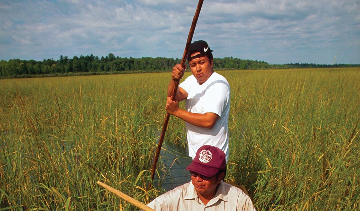
Harvesting traditional foods is important to Native Peoples’ culture, health, and economic well being. In the Great Lakes region, wild rice is unable to grow in its traditional range due to warming winters and changing water levels (from Bennett et al. 2012).
As we conclude the technical, Remote Sensing and Climate Science piece of this course, let us come full circle, so to speak, to the people piece. What is the point of knowing—of “doing science”—anyway, if not to serve the wellbeing of our community. And can we truly be well, without a flourishing earth system in which to participate? What is your responsibility, as Robin Kimmerer asks, in return for the gifts of the earth?
Peoples’ Ways of Knowing is sometimes divided into Western Science and Traditional Ecological Knowledge. What do you think about that? Are these ways of knowing separate? Can they compliment each other? Our approaches to both receiving knowledge and existing on the earth can be simple and/or profound and transformative. Think about how you and your community fit into the unfolding story of people living on earth.
Click the Bubbles Above or the Double Arrows () to Explore this Principle
Y. Resources: Supplemental Materials
Click the Bubbles Above or the Double Arrows () to Explore this Principle
Z. References
Bennett, T. M. B., N. G. Maynard, P. Cochran, R. Gough, K. Lynn, J. Maldonado, G. Voggesser, S. Wotkyns, and K. Cozzetto, 2014. Ch. 12: Indigenous Peoples, Lands, and Resources. Climate Change Impacts in the United States: The Third National Climate Assessment, J. M. Melillo, Terese (T.C.) Richmond, and G. W. Yohe, Eds., U.S. Global Change Research Program, 297- 317. doi:10.7930/J09G5JR1. Available from: http://nca2014.globalchange.gov/report/sectors/indigenous-peoples
Berry, B. 2018. Geometric Processing [Internet]. [cited 2019 Jan 13]. Available from: https://slideplayer.com/user/14083362/. Modified from: MicroImages, Inc. 1999. Getting started: Rectifying images. Lincoln, Neb.: MicroImages, Inc.
Butcher G, Mottar J, Parkinson CL, Wollack EJ. 2016. Tour of the Electromagnetic Spectrum. 3rd ed. Washington DC, NASA. 32p. Available from: https://science.nasa.gov/ems/
Buckmaster G, Todd M, Smith K, Bonar R, Beck B, Beck J, Quinlan R. 1999. Elk Winter Foraging Habitat Suitability Index Model Version 5. Available from: https://friresearch.ca/resource/elk-winter-foraging-habitat-habitat-suitability-index-model
Campbell JB. 2005. Chapter 10: Visual interpretation of aerial imagery. In: Aronoff S. Remote Sensing for GIS Managers. Redlands CA: ESRI Press. p. 69-109.
Chinsu, L., C.C. Wu, K. Tsogt, Y.C. Ouyang, and C.I. Chang. 2015. Effects of Atmospheric Correction and Pansharpening on LULC Classification Accuracy Using WorldView-2 Imagery. Information Processing in Agriculture. 310(2):25-36
Congalton RG, Green K. 1998. Assessing the accuracy of remotely sensed data: principals and practices. Boca Raton, Florida: Lewis.
Jansen D, Luckman AJ, Cook A, Bevan S, Kulessa B, Hubbard B, and Holland P R. 2015. Brief Communication: Newly developing rift in Larsen C Ice Shelf presents significant risk to stability. The Cryosphere Discuss., 9, 861–872, doi:10.5194/tcd9-861-2015
Hall DK, Riggs GA, and Salomonson VV. 1995. Development of methods for mapping global snow cover using moderate resolution imaging spectroradiometer data. Remote Sensing of Environment. v.54 27–140.
Kao HM, Ren H, Lee CS. 2014. Calibrated ratio approach for vegetation detection in shaded areas. J. Appl. Rem. Sens. 8(1) 083543. Available from: https://doi.org/10.1117/1.JRS.8.083543
Lillesand T, Kiefer R, Chipman J. 2015. Remote Sensing and Image Interpretation 7th ed. Hoboken (NJ): Wiley Publishing. 736 p.
Maldonado JK, Shearer C, Bronen R, Peterson K, Lazrus H. 2013. The impact of climate change on tribal communities in the US: displacement, relocation, and human rights. Clim Change 120(3):601–614
Norton, J. 2008. The Use of Remote Sensing Indices to Determine Wildland Burn Severity in Semiarid Sagebrush Steppe Rangelands Using Landsat ETM + and SPOT 5. Thesis (M.S., Geology (Geographic Information Science)) Idaho State University.
Rouse, J.W., Jr., R.H. Haas, J.A. Schell, and D.W. Deering. 1973. Monitoring the vernal advancement and retrogradation (green wave effect) of natural vegetation. Prog. Rep. RSC 1978-1, Remote Sensing Center, Texas A&M Univ., College Station, 93p. (NTIS No. E73-106393)
Satellite Imaging Corp. 2017. About Orthorectification [Internet]. [cited 2019 Jan 6]. Available from: https://www.satimagingcorp.com/services/orthorectification/
Stevens, M., D.C. Darris, and S.M. Lambert. 2000. Plant guide for common camas (Camassia quamash ssp. breviflora). USDA-Natural Resources Conservation Service, National Plant Data Center, Greensboro, NC, and Corvallis Plant Materials Center, Corvallis, OR. Available from: https://plants.usda.gov/plantguide/pdf/cs_caqub2.pdf
Sultan, M., Arvidson, R.E., Sturchio, N.C. and Guinness, E.A., 1987. Lithologic mapping in arid regions with Landsat thematic mapper data: Meatiq dome, Egypt. Geological Society of America Bulletin, 99(6), pp.748-762
Xiao X, Shen Z, Qin X. 2001. Assessing the potential of VEGETATION sensor data for mapping snow and ice cover: a Normalized Difference Snow and Ice Index. International Journal of Remote Sensing. v.22(13) 2479–2487.
Additional Reading
Maldonado, Julie & M Bull Bennett, T & Chief, Karletta & Cochran, Patricia & Cozzetto, Karen & Gough, Bob & , Margaret & Redsteer, Margaret & Lynn, Kathy & Maynard, Nancy & Voggesser, Garrit & Jacobs, Katharine & Moser, Susanne & Buizer, James. (2015). Engagement with indigenous peoples and honoring traditional knowledge systems. Climatic Change. 135. 10.1007/s10584-015-1535-7. Available from: https://www.researchgate.net/publication/283425141_Engagement_with_indigenous
_peoples_and_honoring_traditional_knowledge_systems
Wildcat DR. 2009. Red Alert!: Saving the Planet with Indigenous Knowledge. Fulcrum Publishing 148 pp.
Wildcat DR. 2013. Introduction: climate change and indigenous peoples of the USA. Clim Change 120(3):509–515

